Beebs challenge
Design for the needs of a wide but fragmented demographic audience. Maintain coherence and consistency across the network while providing the flexibility to express the radio singularity and own brand character.
All this staying within the
BBC GEL vocabulary.
What we have learned
The radio is a cultural treasure and a daily companion, but what millions of users want most from a digital radio experience?
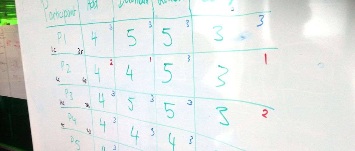
In three months of exploration, interviews and data analysis, We learned that expectations are very different among audience groups, but a common patterns emerged during the testing and research sessions... everybody wants at least, replicate weather not to improve, the same physical analogical radio experience they are familiar with.
Background
Existing legacy contract with a third party supplier and relative code-base that dermined the experience unti then. The actual Radio was launched via a floating Pop-up window (Not a .tab) with a Flash Player (RIP) providing the Audio; that window eventually disappeared when users clicked anywhere else while the audio persisted. Users listened from a magical unknown source after few clicks.
Pop-up Window Script – Very popular at the time!
· newWin = window.open("about:blank", "radio_pop", "width=460,height=500");
· newWin.document.write("iPlayer, Radio");
Process · insights and requirements
Remove the pre–existing pop-up window to reduce friction and unify the experience (Audio/Visual).
Apply the findings, prioritising features and actions to take without compromising the existing platform. Introducing new modules and components one by one while testing in order to avoid potential disruptions.
Maintain the basic radio functionalities while providing a full digital consumption (eg. Browsing schedule on papers then consume Digital Audio) that could potentially bring many advantages.
Create a personalised but flexible and relevant experience for every individual, whatever their needs or interest are (12 Network Core audience segmets).
THE BIG idea
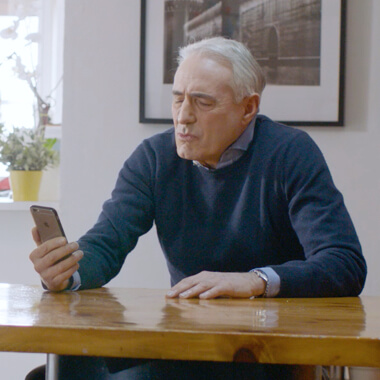
Every great insight comes from observation. During one of the several users interviews a 60 years old lady,
Radio 4 user, told me
"I usually read the paper to see the schedule then I 'open' my husband PC or Tablet then I turn on the Radio". In that instant the idea grew in me to change that behaviour, facilitate her perusal and remove the fatigue".
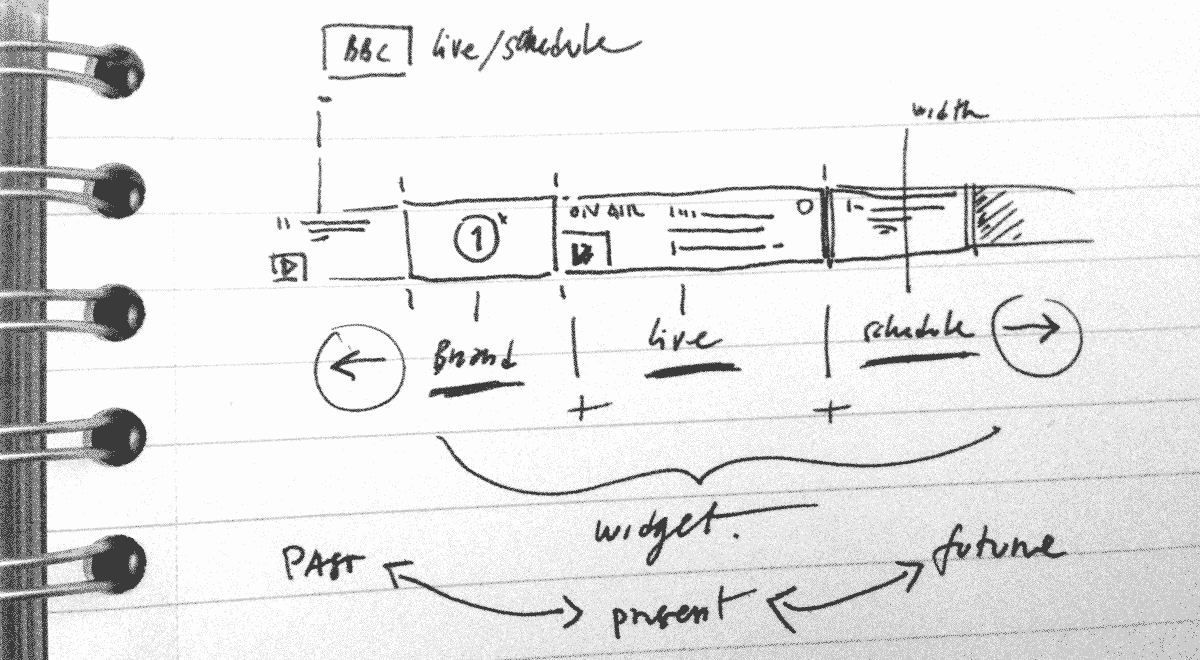
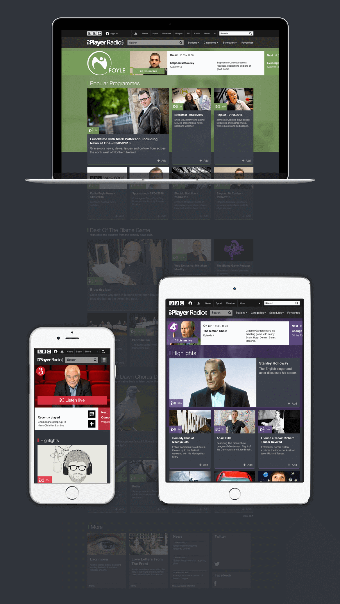
The obvious consequence was simply to introduce a single responsive component that combined the
Branding + Live program (Presence–Present) + Daily Schedule (Past–Future), always available to the users with a simple swipe.
No further element was needed. We had then the
MPV of the new Radio in a single component.
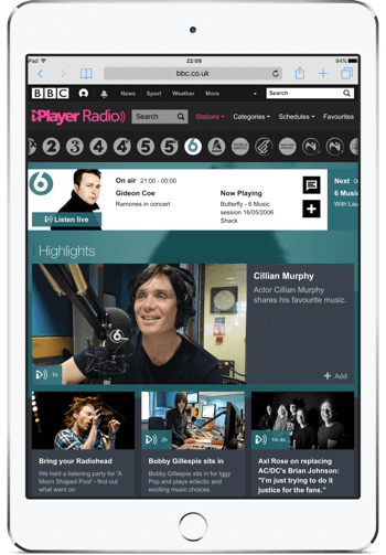
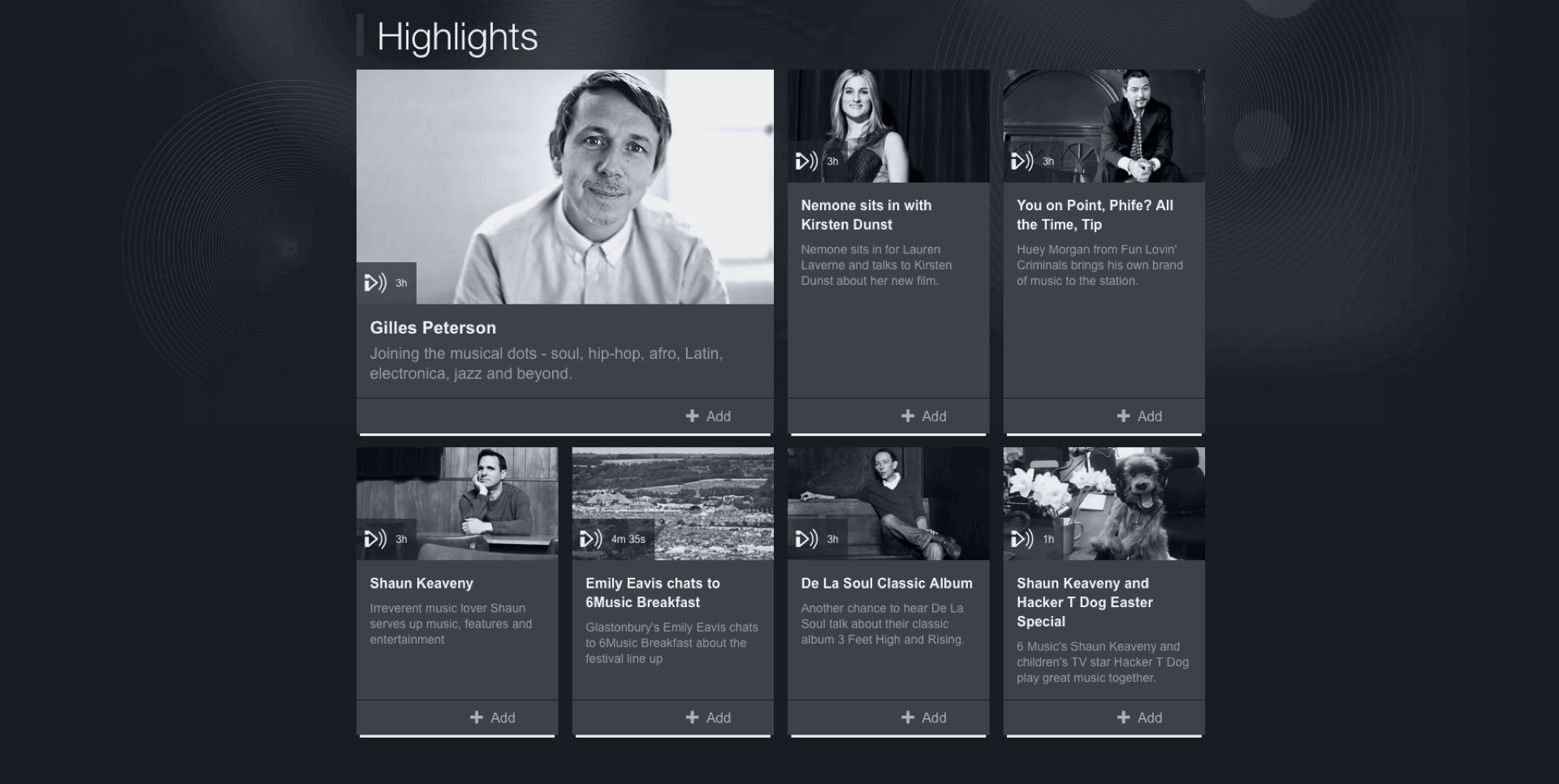
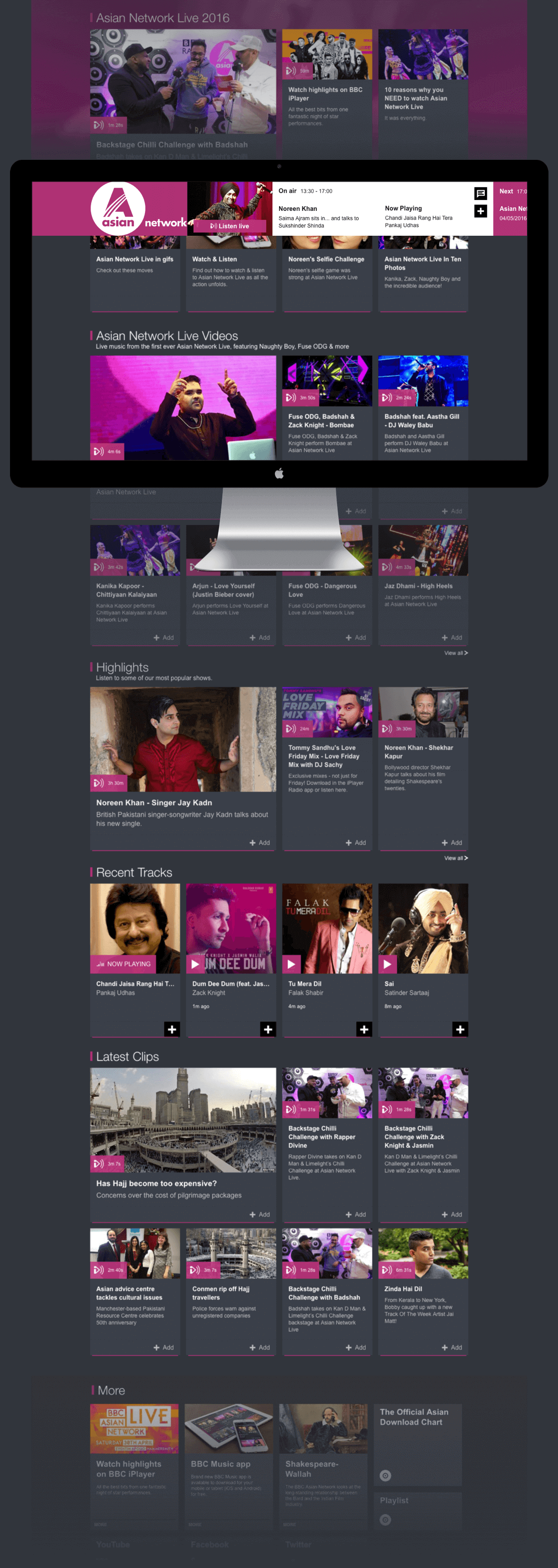
OUTPUT·impact
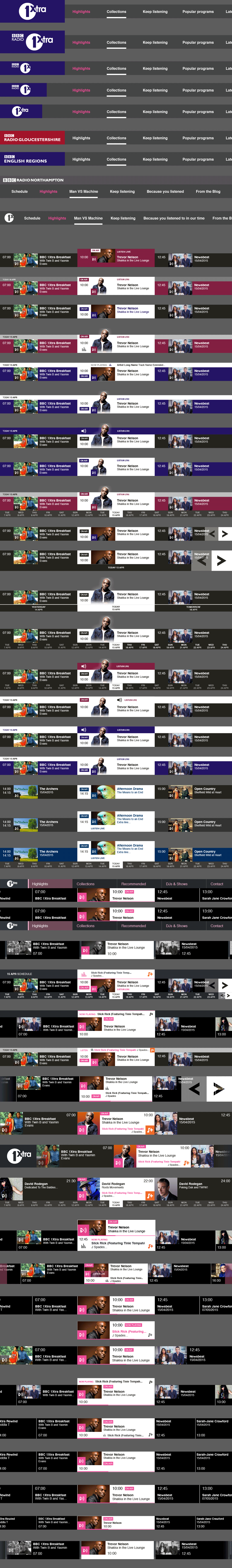
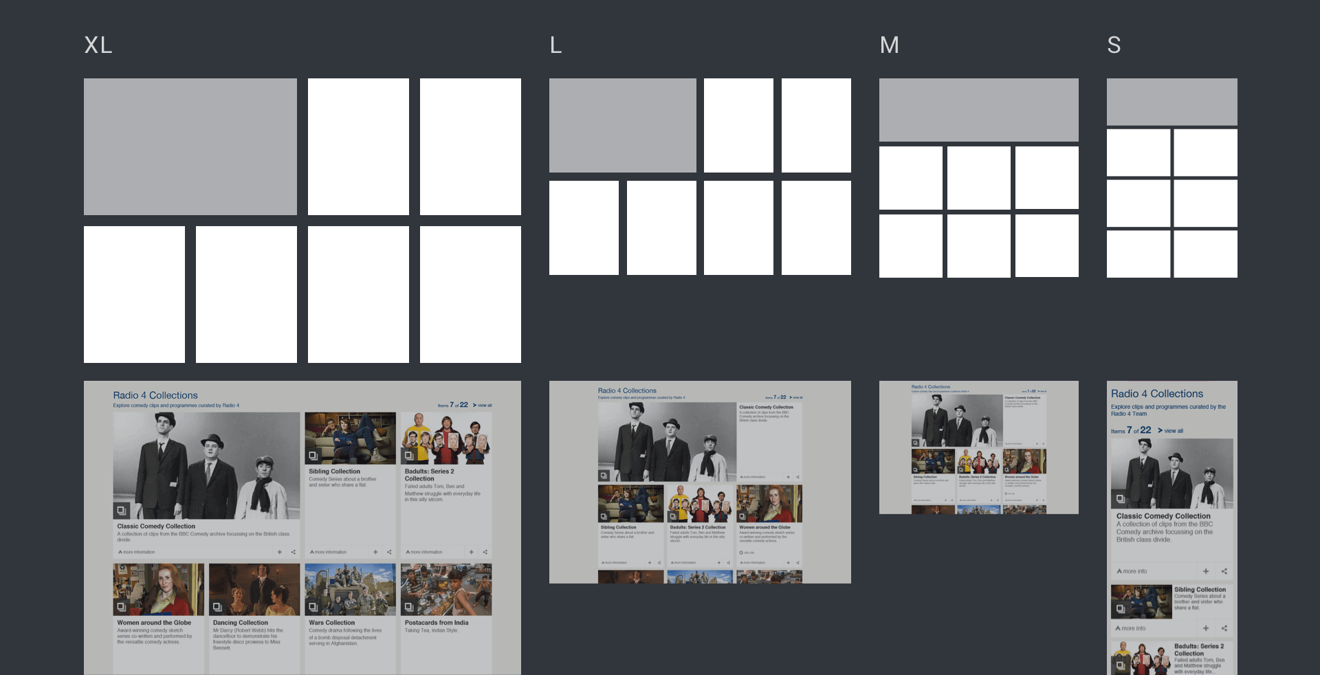
The specific Radio anatomy was then based on a single vertical scrolling page. It is composed by 12 different module groups designed around the whole network publishing needs. Program Radio managers were able to pick and publish the responsive modules they needed to empower them to create their own structure.
– On the "sticky-top" of it ...
The
Branded Live/Catch-up/Schedule widget supersedes all users' expectations through a simple, seamless and delightful immersive listening experience.
It was also providing a simple and intuitive digital service, delivering a station specific daily overview without compromising a deeper content discovery.